Colour Theory in Jewellery Design
The Colour Wheel
One of the best tools for exploring colour combinations is the colour wheel. A colour wheel is made up of a series of colours arranged around a wheel. There are two main colour wheels, one based on the traditional primary colours of red green and blue and the other based on the ink primary colours of yellow, magenta and cyan. The ink based colour wheel allows for the inclusion of bright pink, whereas the traditional colour wheel doesn't.
Both of these wheels can be invaluable when developing a colour scheme for a piece of jewellery.
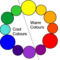
Traditional Colour Wheel divided into warm and cold colours
The primary colours (large circles) are Yellow, Red and Blue
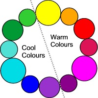
Ink Colour Wheel divided into warm and cold colours
The primary colours (large circles) are Yellow, Magenta and Cyan
A primary colour (large circles in the picture above) is so called because it is a pure colour, with no other colours in it.
A secondary colour (the middle sized circles) is created by mixing two primary colours together, for example red and yellow gives the secondary colour orange.
A tertiary colour (small circles) is created by combining together a primary and a secondary colour.
Warm and Cool Colours
Each of these colour wheels can be divided into two halves, one half with warm colours and the other half with cool colours.
Warm colours, such as red, orange and yellow are exciting and vivid. When used in a piece of jewellery they have a tendency to look closer and to appear larger.
Cool colours such as green and blue are calm and restful. They have a tendency to look further away and to appear smaller next to a warm colour. They often work well as a background colour.
There are several different colour schemes that can be created by using combinations of colours from different positions on the colour wheels.
Monochromatic
A monochromatic colour scheme is a scheme based on only one colour.
This can work well with a piece of jewellery, especially if a mixture of light and dark shades, different surface finishes and different shapes and sizes are used.
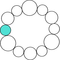
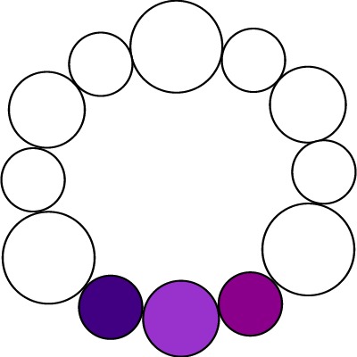
Analogous Colour Scheme
An analogous colour scheme involves using colours lying next to each other on a colour wheel.
This can create a very harmonious colour scheme because all the colours used share a common colour.
Complementary Colour Scheme
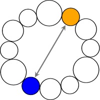
A complementary colour scheme involves using colours opposite each other on the colour wheel.
For example orange and blue.
Putting complementary colours next to each other brings out the colours of the beads and makes each colour appear more vibrant and bright. However, it is important to get the proportions right. A half and half mix of the two colours can be less pleasing to the eye than using a small amount of complementary colour to accentuate the colour of the main beads.
Also because the colours are opposites of each other you will find that one of the colours is a warm colour while the other is a cool colour. It is more pleasing to the eye to have the warm colour in smaller amounts than the cool colour, rather than the other way round.
Offset Complementary Colour Scheme
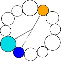
Using a Complementary colour scheme can be very dramatic but can also be a bit strident. An alternative is to use the colour next to the complementary colour on the colour wheel. For example turquoise and orange are almost complementary but give a more restful effect than using the true complementary colours blue and orange.
Split Complementary Colour Scheme
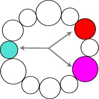
A split complementary colour scheme is made up of three colours.
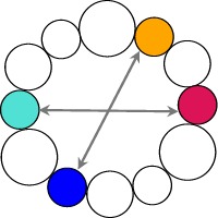
It involves taking a colour on the wheel, finding its complement and then choosing the colours on either side of this complementary colour. For example Turquoise, Red and Pink.
It can give a very attractive, colourful effect, however, as with the complementary scheme, it is important not to have the same amount of each colour. It is much more pleasing to the eye for either the main colour or the two split complementary colours to dominate.
Triadic Colour Scheme
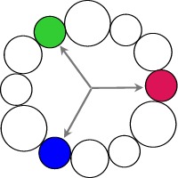
As the name suggests, the triadic colour scheme is made up of three colours. The colours are evenly spaced around the colour wheel.
For example Lime Green, Pinky Red and Blue
Again you need to be careful with the proportions. It can be best to have them in decreasing amounts. For example, one colour should dominate, then there should be a less of the second colour and just tiny amounts, or accents, of the third colour.
Tetradic Colour Scheme.
This is one of the most difficult colour schemes to balance as care needs to be taken to prevent it becoming a jumble of colours.
It is similar to the split complementary scheme but uses two split complementary colours from either side of the colour wheel. It is often also called the double complementary scheme.
It can look best where one of the colours dominates and the other colours are used as accent colours only. =
